
I have been working with something I call “Photo Blends”
Here are some examples:
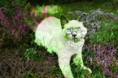
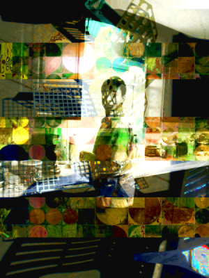
Jungle Kitty
 Earth Mother:
Those two use the same garden photo for the blend photo. So does this next, Garden Nymph:
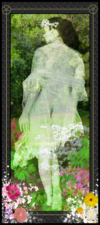
(Many thanks to
~firebabystock for the stock image here)
Wow I seem to love that garden picture best for a blend, here’s another, Jack In The Green:
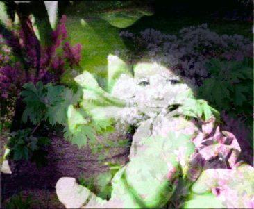
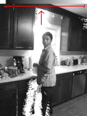
Here’s one I did this week – no title yet:
My parents on their honeymoon:
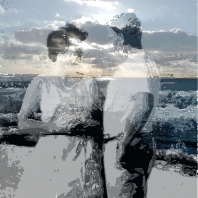
(this is one of my favorites but Mom doesn’t like it too much. I think it’s a bit ghostly for her)
Ok, so what’s with the blends?
You need a subject photo and a blend photo – the beach or a garden or a sunset- whatever.
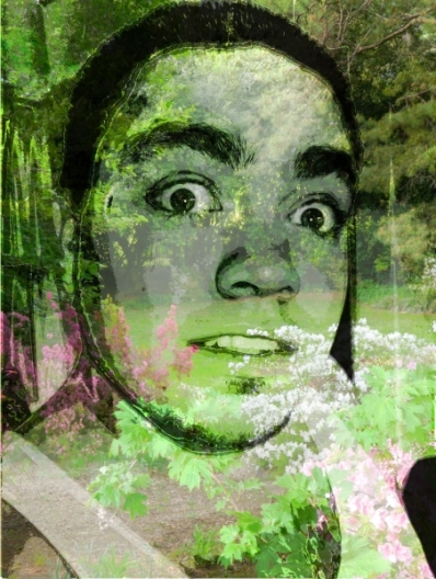
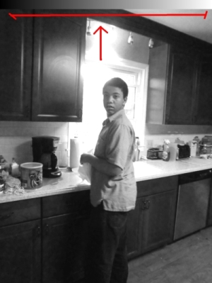
Take a close look and make sure that no strong lines of the photos will conflict with each other. I guess this is why I return to that garden one so often. Sometimes it might work, sometimes not. See the pic of my son at the kitchen sink with no title yet? There’s a grid right across his face. I did not mind it in this instance, but you won’t know if it works right away.
Sometimes you get a lovely surprise. See in “Earth Mother” how the pink flowers seem to fall right where a fancy sleeve would? The whole placement seems to enhance her clothing and make it look like a formal gown. I was stoked by that. In the one of my parent’s honeymoon, the stalks of beach reeds seem to be in Mom’s hand as a bouquet. Cool stuff!
Get the two images the same size.
The blend photo, the secondary one, needs to be prepared.
Step one – get the Advil ready. Tylenol will work too.
OK so, we copy the layer of the blend photo, change the lightness by 20 and save the layer as L1, L2, L3 etc… (for “lighter 1”) and do it again and again till you are having a layer that’s almost white. Maybe you will be at around “L15” by then.
Then you repeat this process but changing the lightness by -20 each time and naming the layers D1, D2 etc…. till you achieve a black one.
Now, copy the subject photo and paste it as a new layer with the blend photo. (It should be the same size right?)
(At this point, to see that they don’t conflict too much, make the subject photo partly transparent for a second. Then you can see what elements of the two photos cross each other. Set it back to opaque after checking.)
Make a duplicate of the subject photo layer. (yeah overkill, but you saved the original again). On this second layer, go into colors>Hue & Saturation and drop the saturation all the way down to a black and white layer. Why not just turn the image to B&W mode, you may ask? Well it will make the entire file B&W and we just want this layer black and white.
Just a note – drag your layers into an order that works best for you. For example – that layer with the original subject photo? I drag that to the bottom out of my way. We will be dragging layers as we work too, to keep it straight which we have done already.
Now the black and white subject layer needs a thin band of a blend from true black to true white. It just needs to be big enough for you to select from. We are going to be selecting colors out of this photo one by one and it’s really hard to see what is the next darkest or the next lightest from among the tones in the photo. The grays next to each other confuse the eye. So this strip makes life very easy. Select a thin strip on the least important edge with the rectangle select tool and then fill it with a black to white blend.
This is what you should have now:
OK here we go!
We will be using the “Color Select Tool”. Not the one that selects just adjacent colors, but the one that selects the same color from the entire photo. I don’t know the name of it in PhotoShop but it’s there. **Important – set this tool so that there is no anti-aliasing – no feathering – nothing “fuzzy select”. It must select a hard edged selection.** Set it to a threshold of about 8. (This is how many colors it grabs)
Add a new, blank, transparent layer.
On your B&W source layer you can begin at black or white – it doesn’t matter but on darker photos I start at white and on lighter ones I start at Black. For this walk through I will start at black.
Select from the black edge of your B&W strip you added on the subject photo.
Now move to your blackest layer of the blend photo and copy. (At this point I usually drag that blackest layer out of the way so I don’t repeat a layer by accident)
Now go back to your subject layer again and, with your selection still selected, delete. (NOT CUT – it will change your clipboard)
Now go to the transparent layer and paste. (If you do this before the deleting step above, your selection will go away and you can’t delete the selection)
The subject photo starts looking like this. As you can see it’s easy to find the next darkest place to select. (That white hole is transparent really)
So that’s it. You just keep working down the strip till your subject photo is gone and the transparent layer is full of your new image.
Pay attention to the amount of strip left to how many layers you have left. Sometimes I have to skip every other one so that my whites hit on the white layer or black on black, but you will get a feel for it. The threshold of the selection tool can be adjusted too. All this is just aim.
There are other ways of blending two photos but this gives a neat look that I like. I hope you like it too.

